The challenge
Education is one of the wicked problems in design thinking. The main challenge in this project was abstracting and formalizing all the product needs to make an MVP in two months to attract potential investors.
Context
Education is a large and complex problem that has been growing throughout history. Therefore it has many needs that Xplain can solve. But Xplain is a startup that only had the budget to materialize the core functions to give a quick overview of the idea and its potential to attract investors.
The approach
I spent the first weeks exploring, investigating the competition, and ideating solutions with the CEO and CTO. We analyzed how potential competitors solved the problem, how efficient it was, and why many failed. I studied their line of communication and their digital platforms. After all the competitive analysis, I had the necessary vision and tools to start designing.
Deliverables
- Brand identity with core elements such as style, logo, colors, illustrations, and voice.
- Market research, emotional journey, user personas, and user flows
- Students App architecture, wireframes, and High-fidelity mockups.
- Design and develop their current website.
During the creation of the brand, we stood with three concepts we wanted Xplain to reflect on and remain firm. Inclusion, Curiosity, and Collaboration. Under these pillars, we built a system of androgynous and inclusive illustrations in black and white, together with the brand's colors we used everywhere.
After many sketches and illustrations, this is the final result of the Xplain logo. The logo's shift from dark purple to medium purple to light purple references the broad spectrum of types of people this initiative encompasses. Xplain was born for everyone who wants to teach and learn regardless of race, sexual orientation, age, or status.
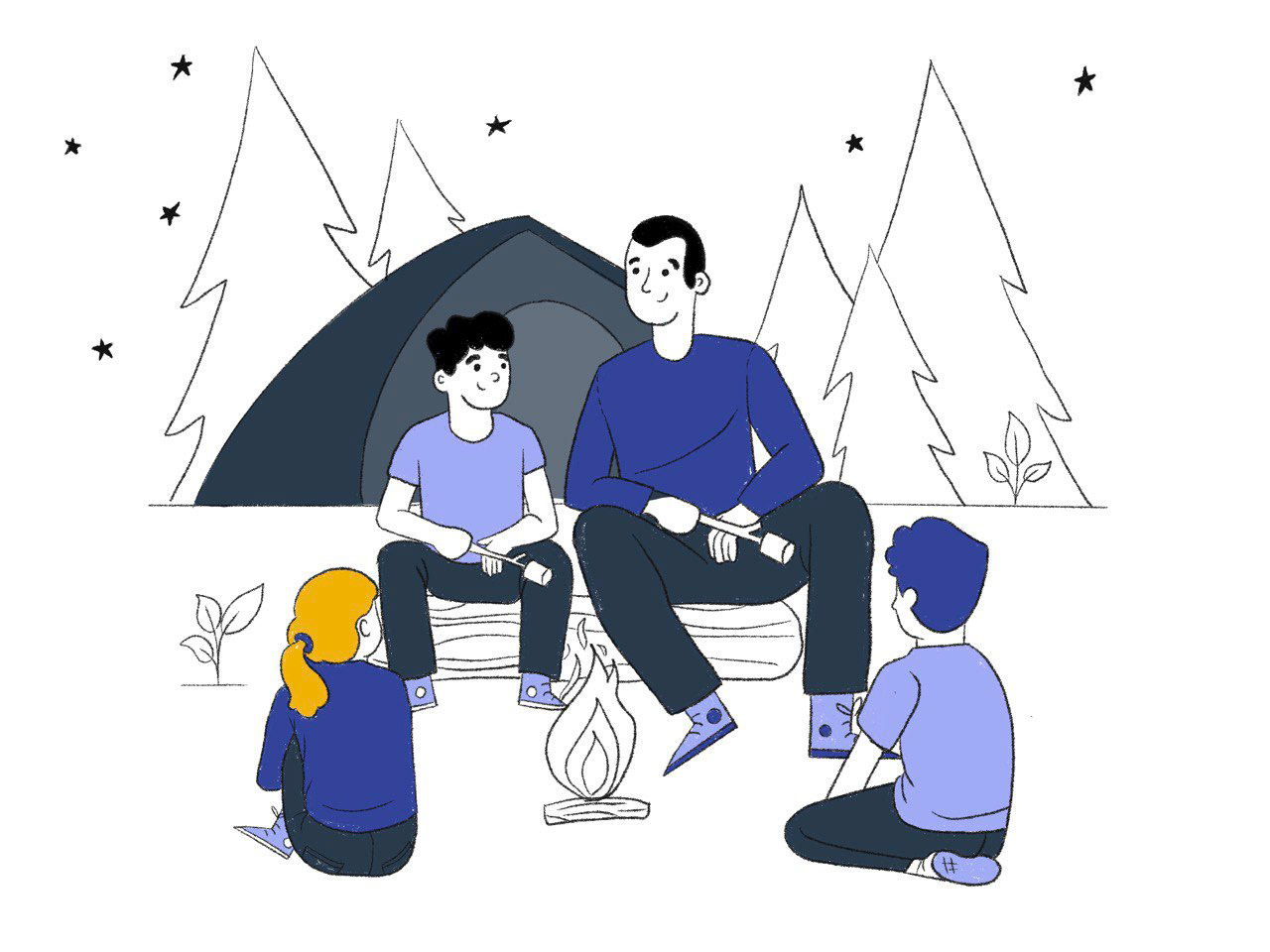
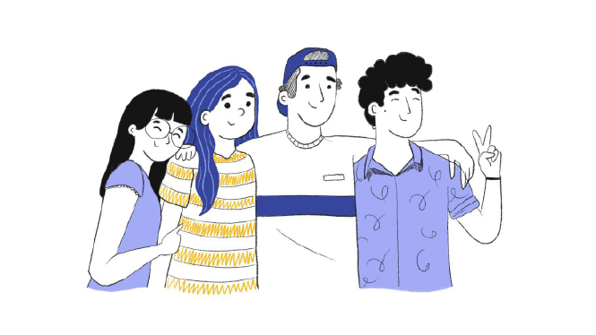



We explored different styles. Our goal was to be direct without being pushy.
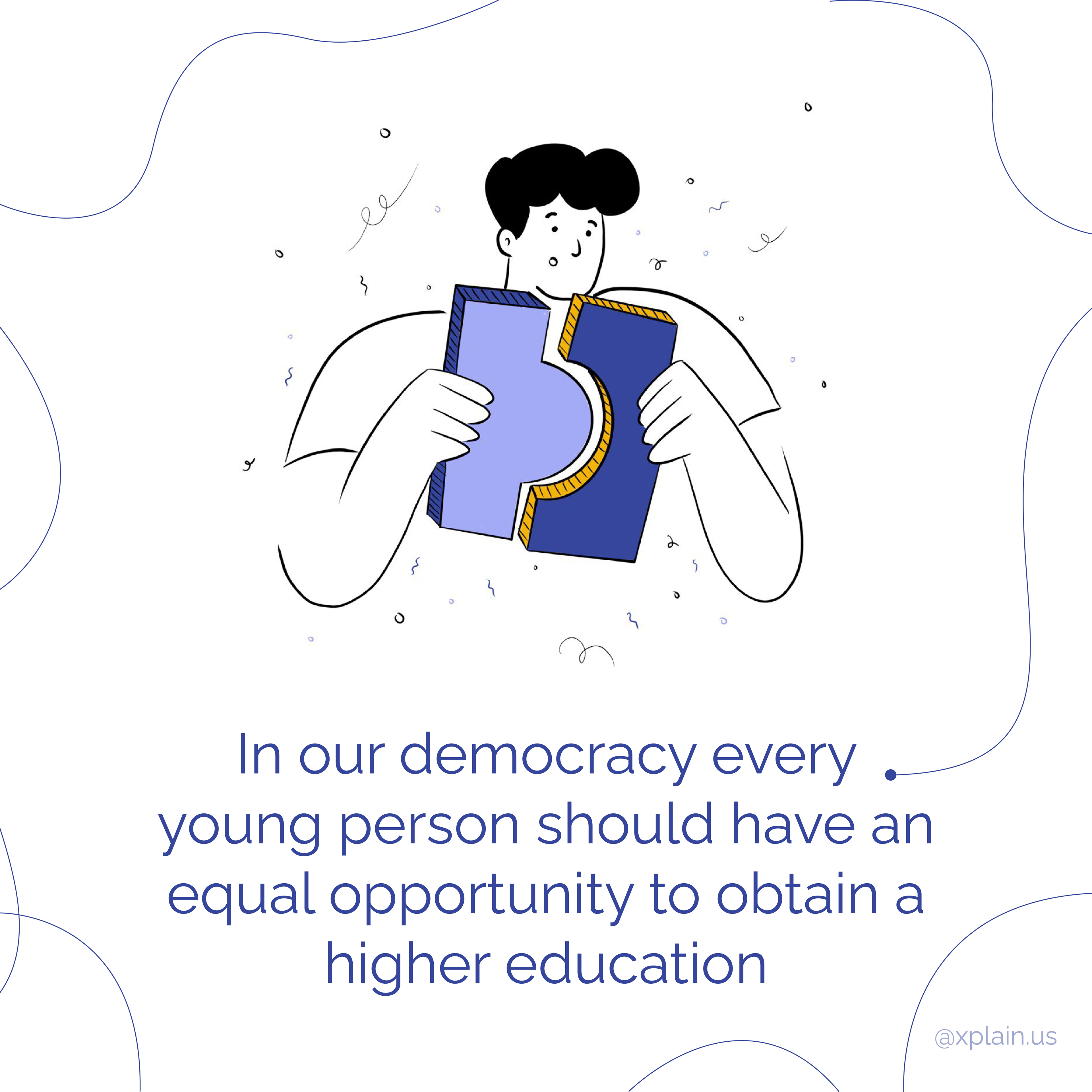
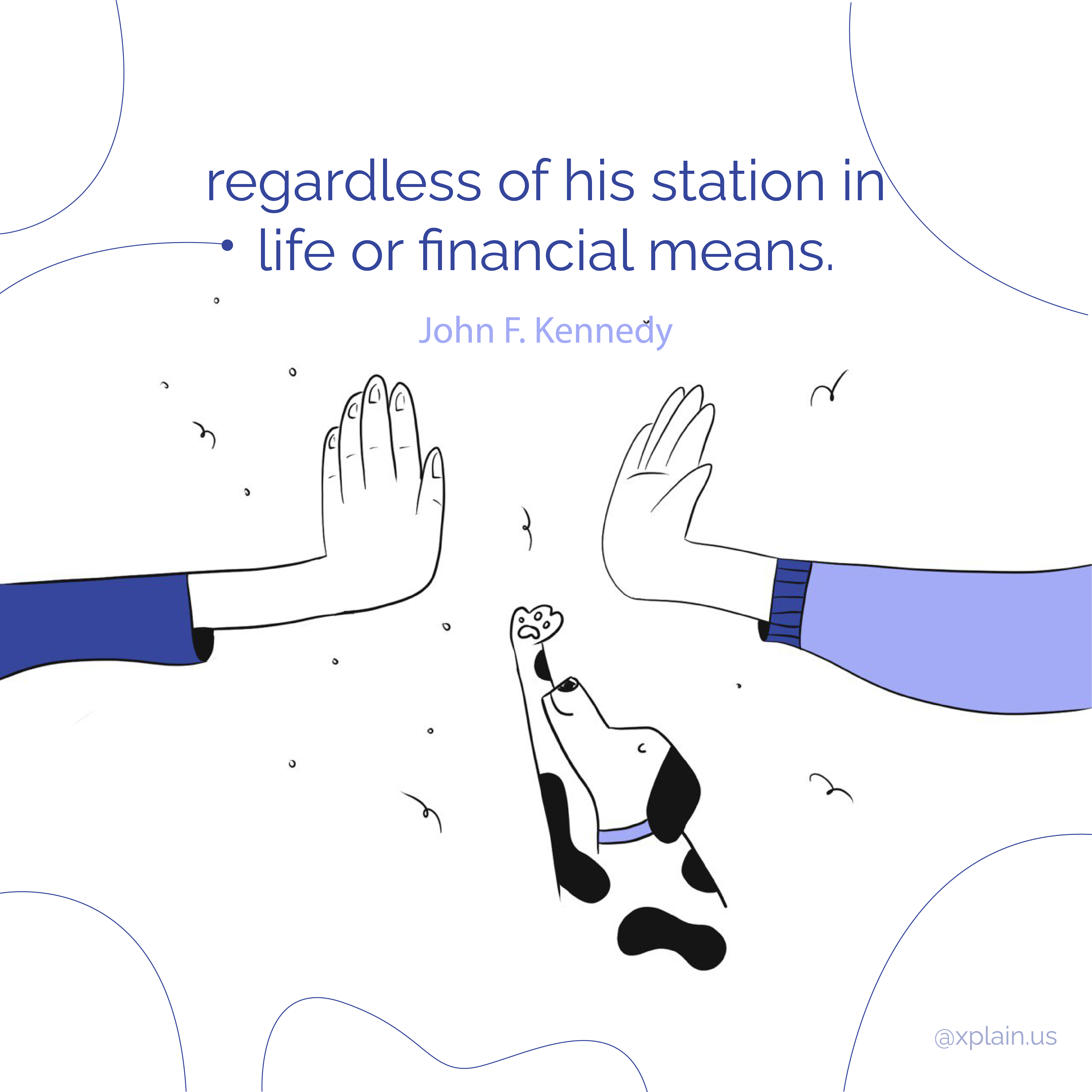
To understand our users better, we ran several surveys collecting data about our potential users. Then we created Archetypal users, also known as personas. We used this to imagine how different people with different desires and abilities will experience the app. The archetypes beneath are just the tip of the iceberg for this exercise that helped us put ourselves in the users' shoes.
A person's relationship with a product or service changes over time. Energy rises and falls as users feel curiosity, pleasure, and satisfaction. Users may also hit negative patches of doubt, frustration, and anger. In order to help produce positive memories, we created a customer and emotional journey to understand deeper the habits of our target users.
Students app development
The mission was to develop an intuitive platform that connects students hungry for knowledge with mentors who can help them exploit their potential. After investigating the competition, we dedicated ourselves to building the logic of the Xplain student app.
After several iterations, we created a solid site map that later became wireframes.
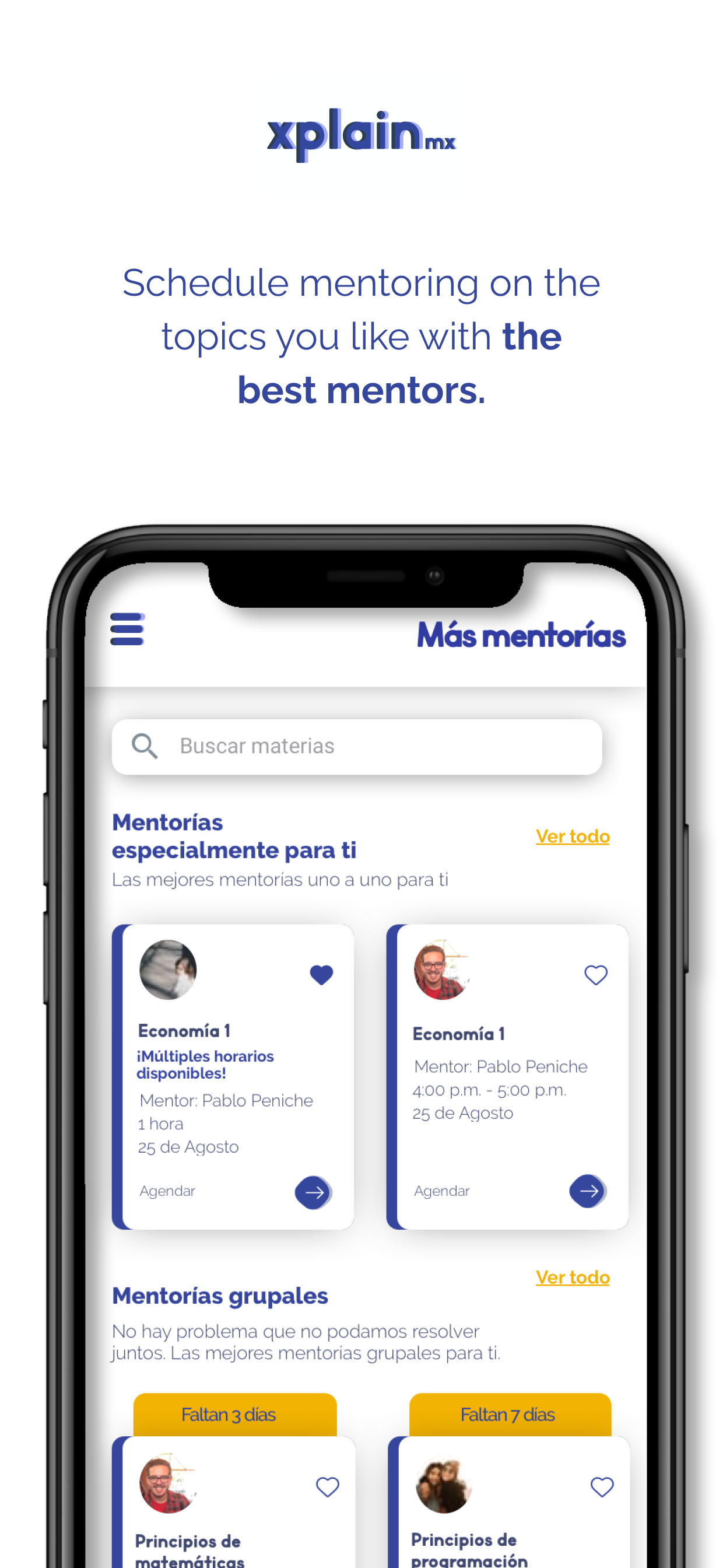
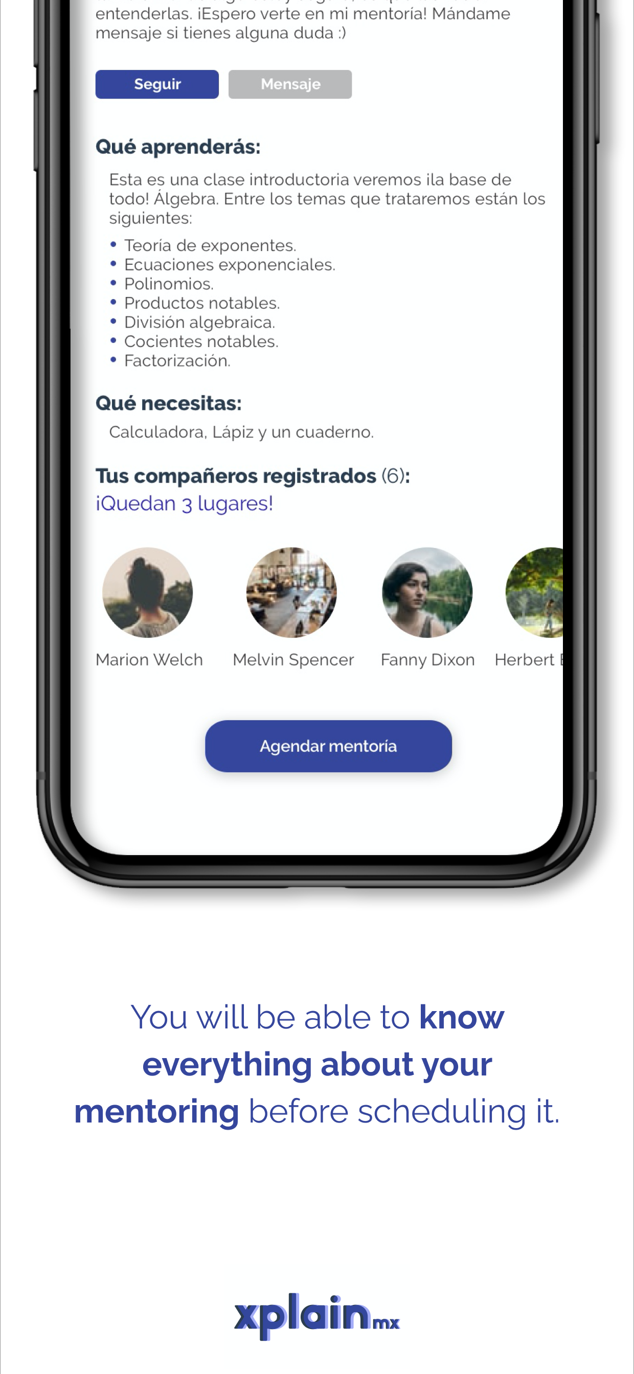
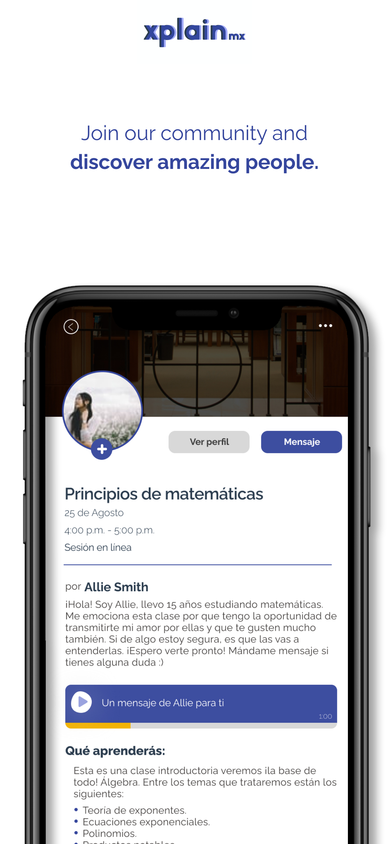
Once the wireframes were approved, I dedicated myself to making the High-Fidelity mockups. We design and develop more than 20 screens to produce the MVP of the student app.
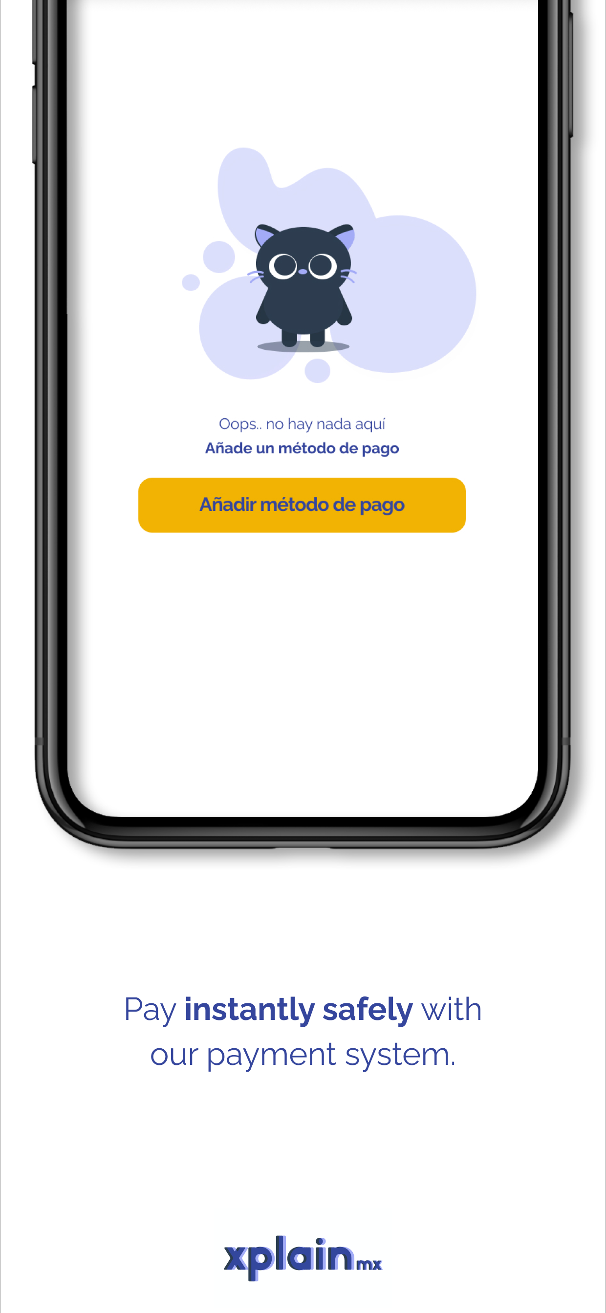
Here are some thumbnails designed for the app store.
Main website
I also helped them design and implement their website. The main objective is to promote the app and get early users and mentors.
The future of education lies in the fair collaboration between us. I enjoyed creating Xplain. Their mantra, "be who you needed when you were younger," sticks with me. Xplain is a project that will grow with a community that believes in the power of collaboration as the years go by. This case study continues in constant growth and evolution. I love to work on projects that seek to impact the world positively.
